Finished Projects
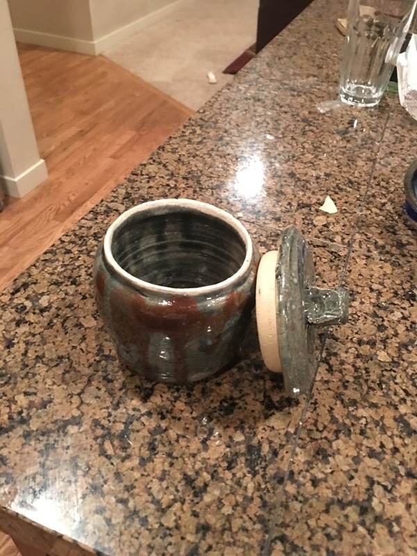 My lidded project is a green cookie jar with splatters of brown and green. For this project, I had to practice sizing using the red tool in order to make my project fit together, which it did quite smoothly. I used the contrast of green and brown to create a sort of disharmony, since I wanted to test how the contrast would affect the viewer of my project, since I tend to stick with more harmonious colors. The intent of the project is to create a minor amount of discomfort in the viewer, as well as show an earthier dimension to my art.
0 Comments
Leave a Reply. |
AuthorWrite something about yourself. No need to be fancy, just an overview. Archives
June 2017
Categories |
 RSS Feed
