Finished Projects
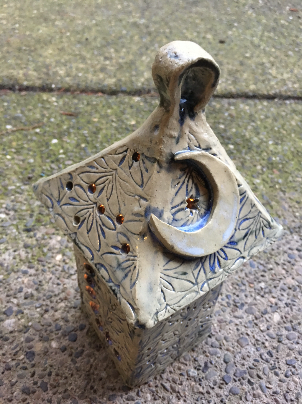
 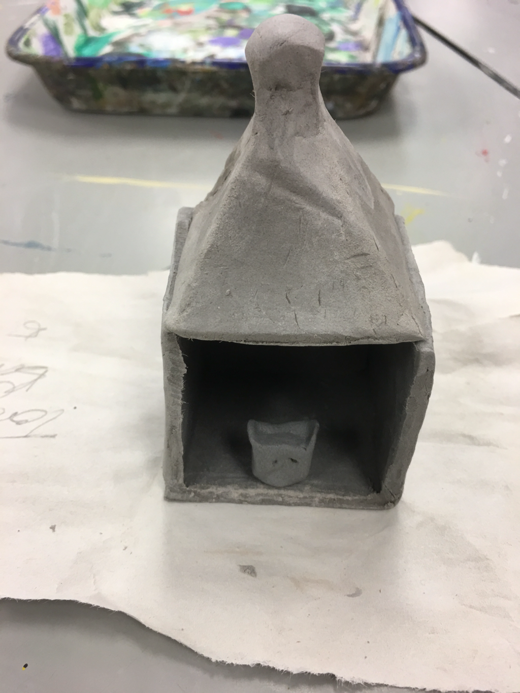 For my two projects, I made a bunny in a cage, and a little owl lantern/shrine. My main project, the shrine, is a bit smaller than I had hoped, because I was absent for testing, but it meets the other requirements because it has negative space and a handle for detail.
0 Comments
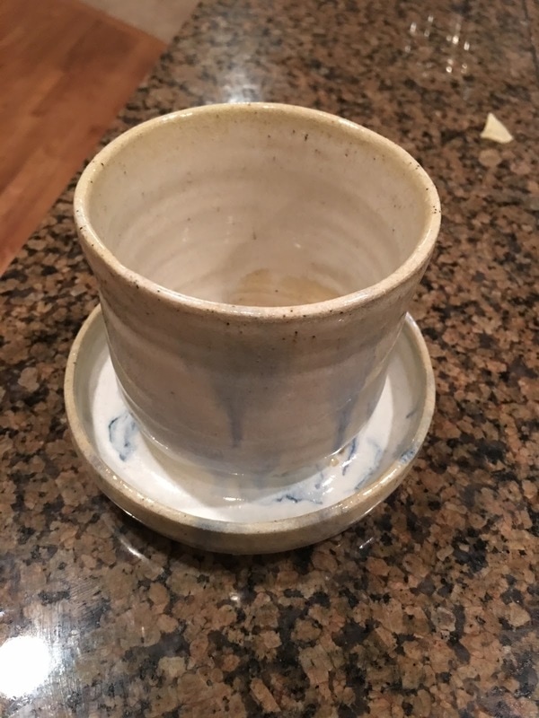
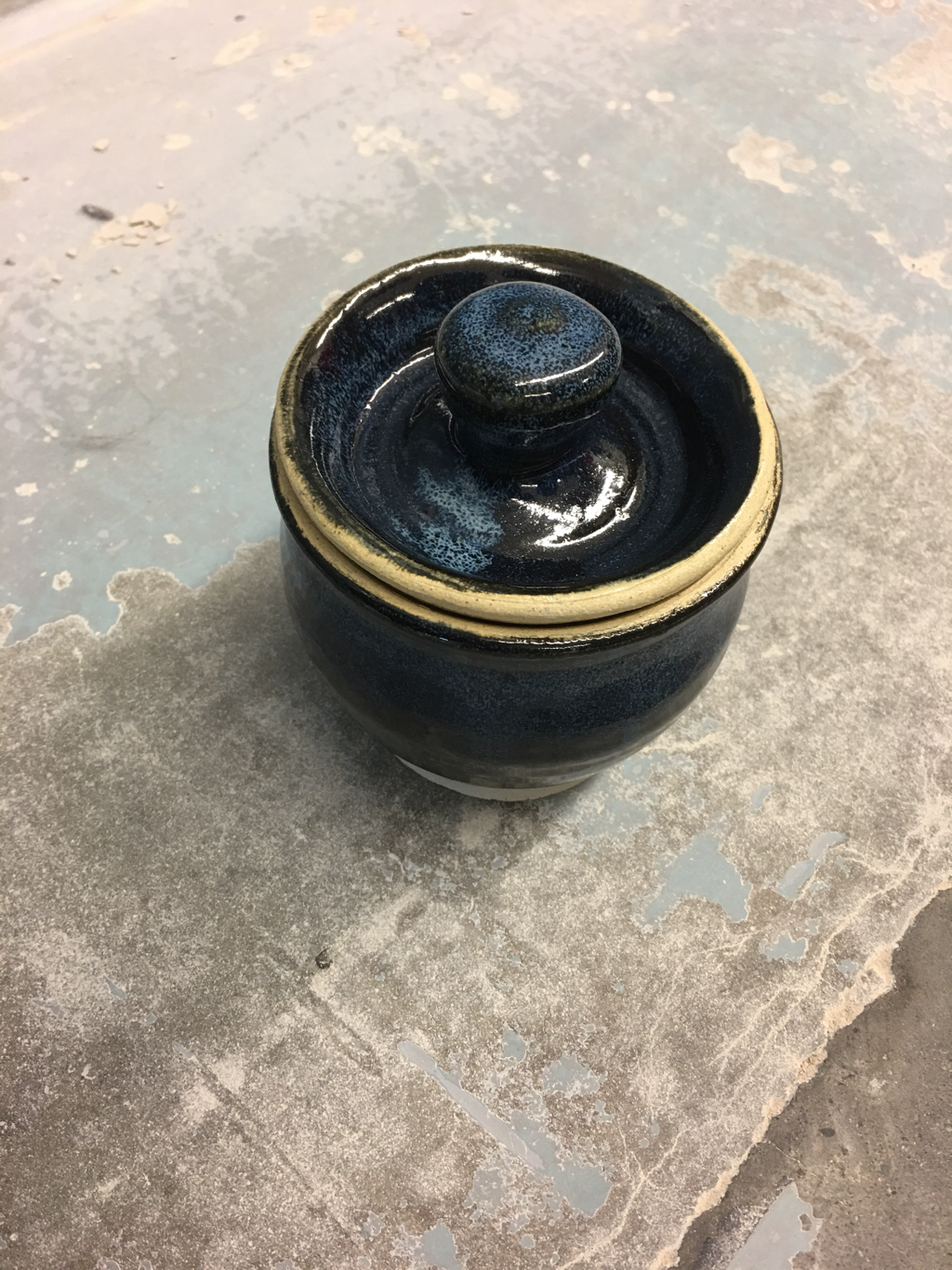  My inset is a medium vase with an inset lid, glazed with black and white glaze to create flecks of blue. During this project, I learned how to make an inset lid, which I think is much more elegant than the other kind of lid, so I use it more now. My project's form creates balance because every piece of it fits together smoothly, and no part of it detracts from any other part. I think my project has a nighttime motif since the blue on the black looks similar to stars.
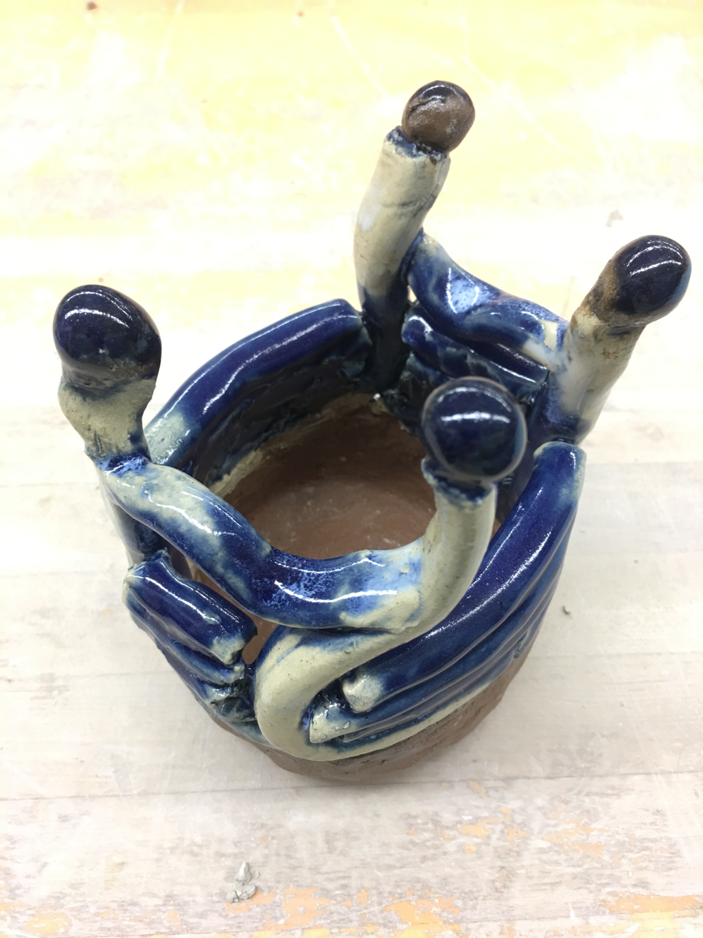
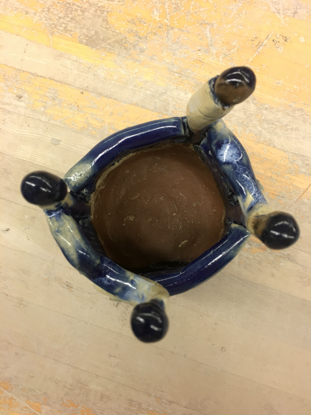
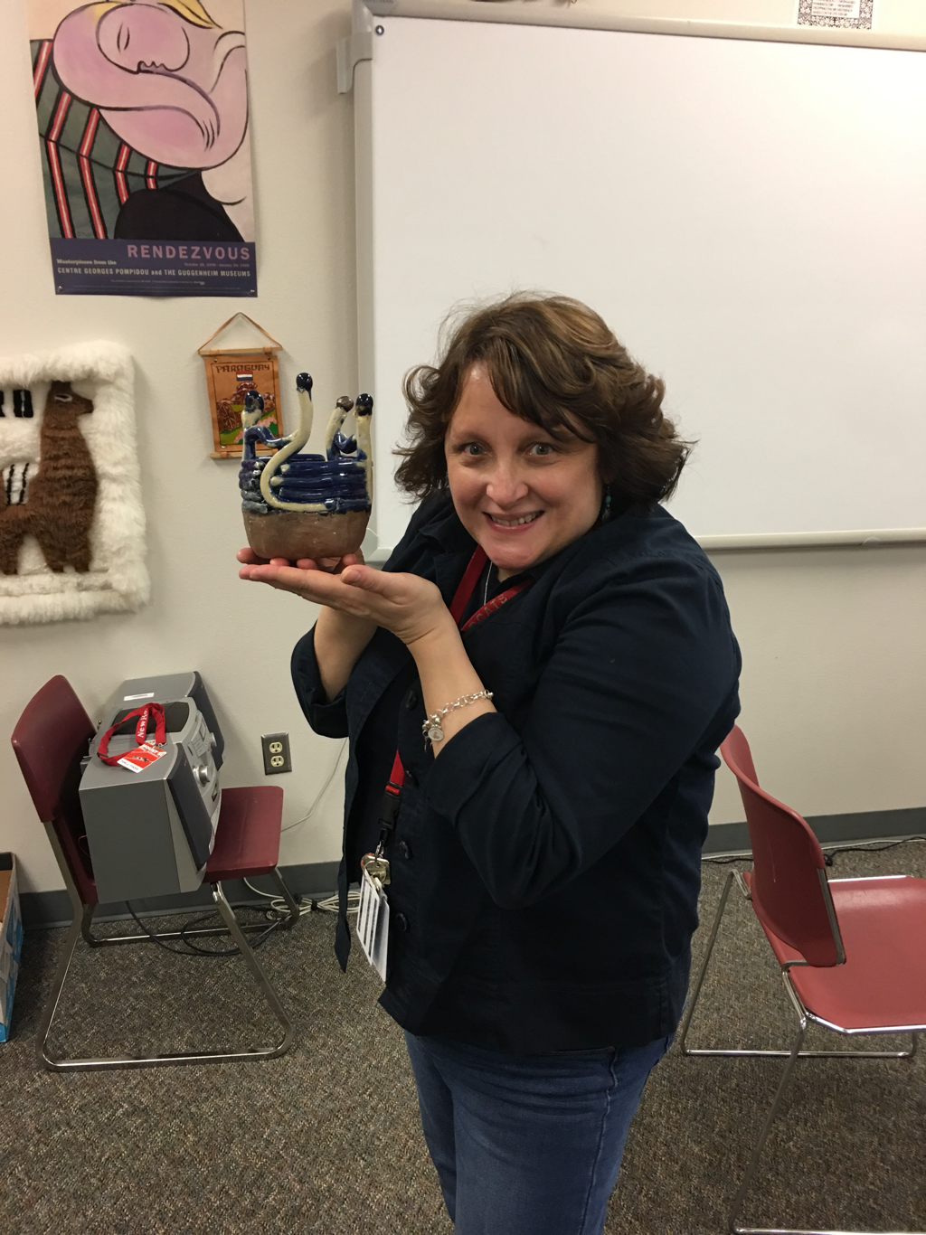
Ms. Heideman Told Me To Call Her Out For This On My Blog. She Accidentally Broke My Planter.4/7/2017 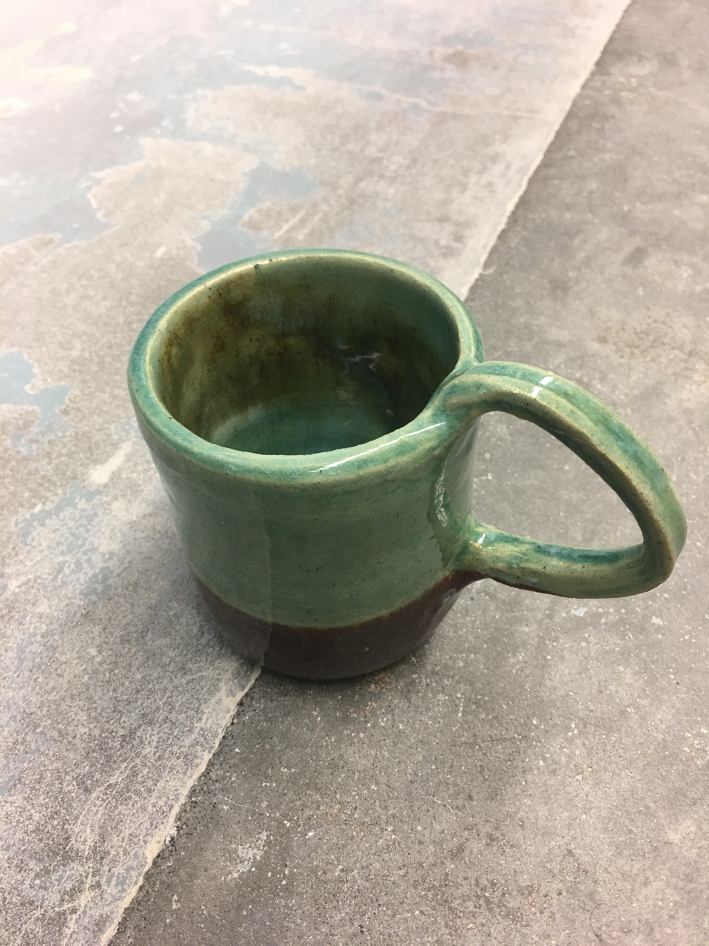 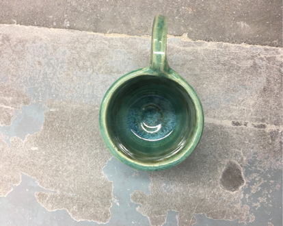 For my handle project, I made a green and brown cup, with white glaze on the inside to blend the two colors. During this project, I practiced pulling a handle, which is a skill I have to practice still, because I do struggle with handles. This cup uses color to create contrast between the brown and the gree, which are clearly divided across the cup. I think this cup is very earthy looking the way the brown transitions into the green, but I do not know if that's a good motif for a cup.
 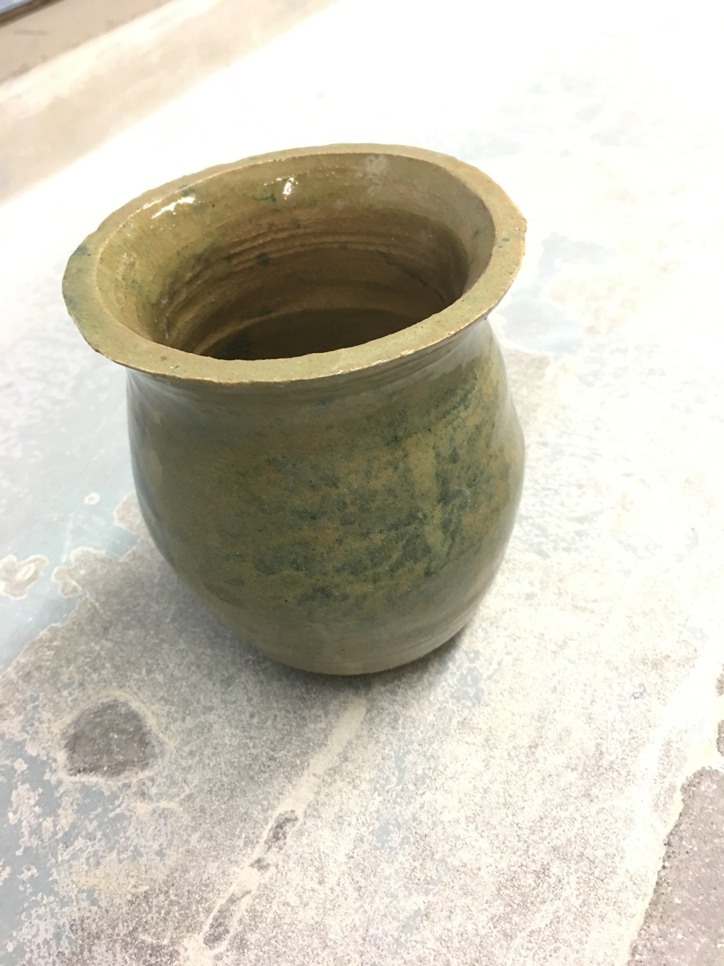 My tall project is a light brown case with decorations in different shades of blue. I did not learn any new skills while making it, but my wonderful teacher told me that it's so lopsided because of how I was sitting, which I fixed for later projects. My project's *ahem* interesting glaze created a smooth texture in the blue highlights which caused movement to those spots, since they contrasted the brown. This pot looks very earthy, and I suppose it is a decent vase, but I think I can make one much better, so right now, this is a placeholder.
   For our group Coil project, Austin, Jack, and myself made a blue and white Spanish punctuation pot (hence the upside down exclamation points and question marks), with a solid red clay base. For our project, my group had to practice keeping our coils from drying out since our project almost broke numerous times. We used color to create contrast in two places, firstly we made the punctuation white and the pot blue, and we left the red clay as it was to offset the blue as well. Our project is representative of the Spanish language because it features three different Spanish language symbols, and Sra. Foster was very appreciative of our theme.
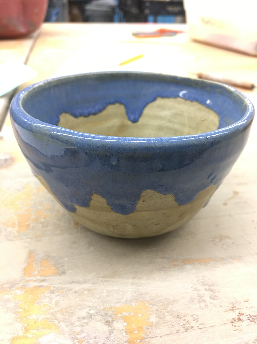 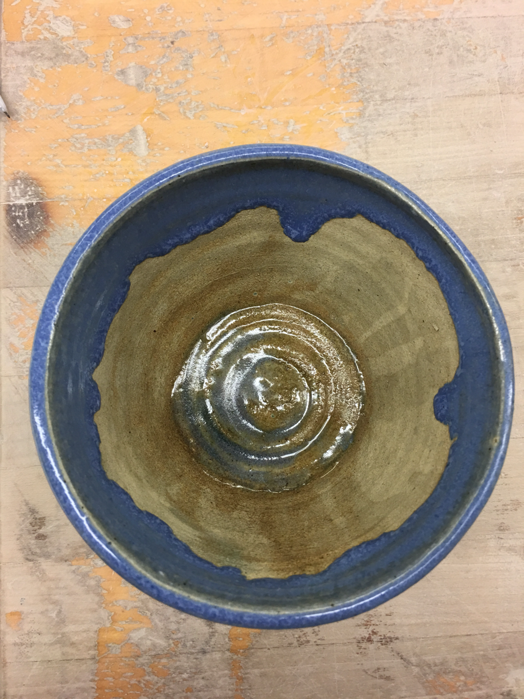 my first bowl project is a smallish bowl glazed with light brown and light blue that has a dripped effect on its edge. With this project, I practiced using thinner glazes to get colors to drop down which I believe worked quite nicely. I used the line and color of the dripped glaze to create movement with the viewer, since the glaze is very pronounced in my project. My bowl reminds me of a beach, with the wavy pattern of the blue meeting the sandy pattern of the light brown.
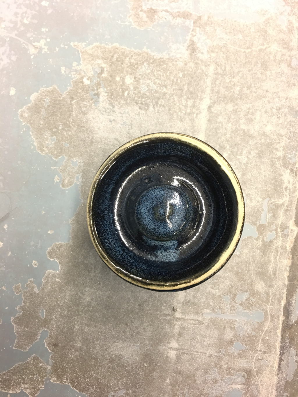
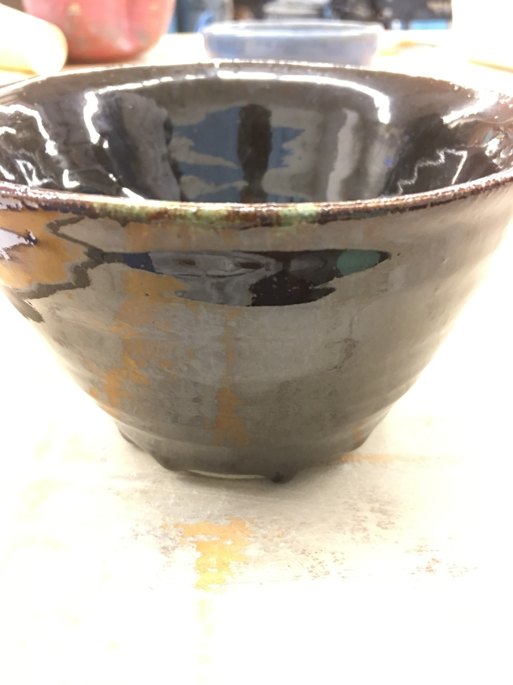 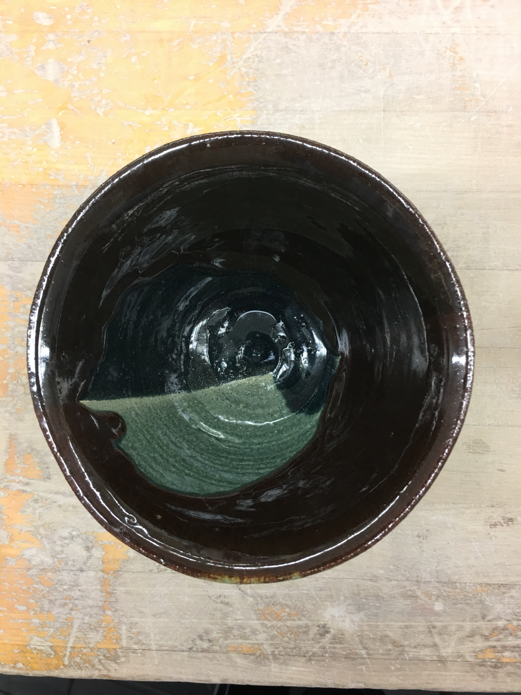 .My bowl is a medium sized metallic brown bowl with a circle of dark green and light greenish blue in the center. I used this project to practice working with darker colored glazes, since I don't use them very often and I thought this would be a good opportunity. I used color to create a sharp contrast between the metallic brown and the lighter blue and green. This project has a mildly earthy feel because of the pop of green on the brown.
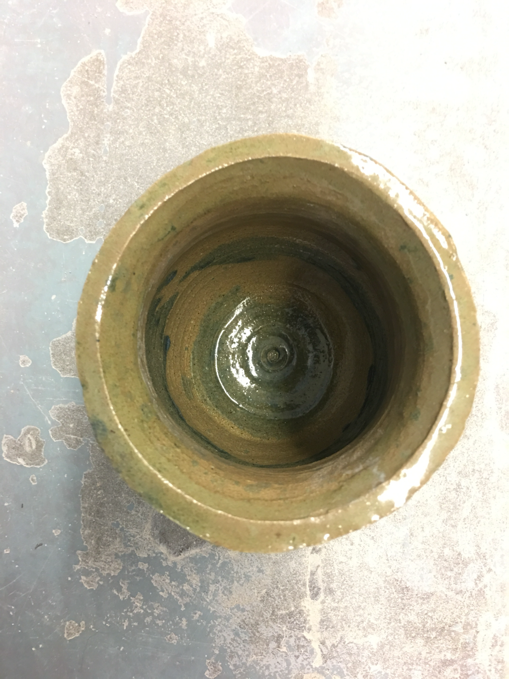
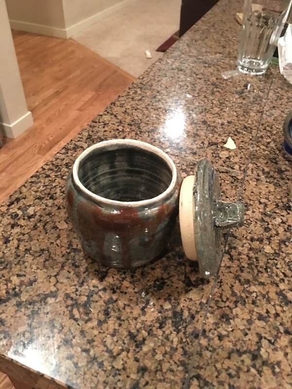 My lidded project is a green cookie jar with splatters of brown and green. For this project, I had to practice sizing using the red tool in order to make my project fit together, which it did quite smoothly. I used the contrast of green and brown to create a sort of disharmony, since I wanted to test how the contrast would affect the viewer of my project, since I tend to stick with more harmonious colors. The intent of the project is to create a minor amount of discomfort in the viewer, as well as show an earthier dimension to my art.
 For my wheel planter, I made a white planter with blue details. For this project, I had to practice double pulling without breaking through the bottom of the project. It took me five tries. I chose to use value of the blue on the white to create harmony, and so my planter looked very put together. My planter gives off just a sense of relaxation, because of the way the blues flow into the white and blend together.
|
AuthorWrite something about yourself. No need to be fancy, just an overview. Archives
June 2017
Categories |
 RSS Feed
